Employee Check-In app
PROBLEM
The existing check in app was confusing for users, it has poor mobile usability and misaligned with company brand standards. (Buttons are unclear, excess of confirmation modals and confuse components)
This app was essential for daily operations , improving usability had a direct impact on operation efficiency.
Goals
- Users can identify easily check in section
- Clare usability in principal check in flow
- Align design with updated brand identity
- Create a faster and more intuitive mobile UI
MY ROLE
I owned the end-tp-end process, conducted user research, redesign core flows, created wireframes and high fidelity wireframe and collaborate closely with Product owner, Internal stakeholders, Tech lead, Devs for implementation.
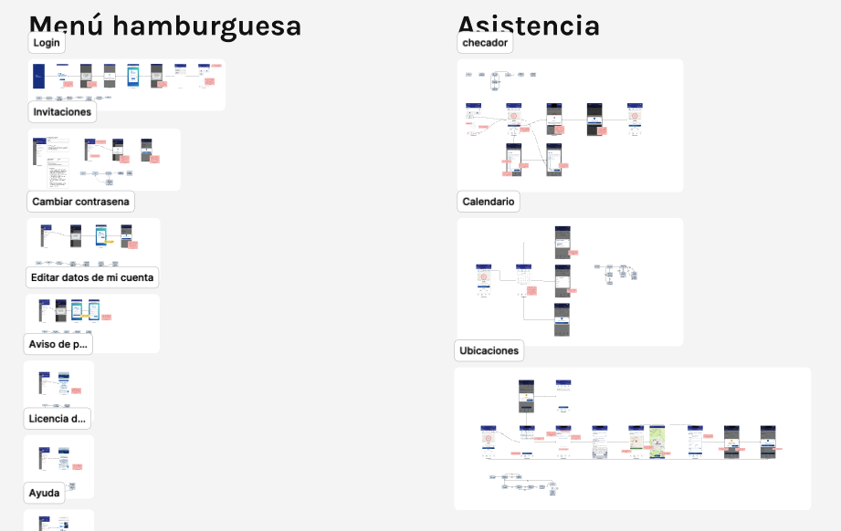
PROCESS
Research
I analyzed similar apps to identify UX patters and pinpoints
Ran 15 internal user interviews
Sent a first click survey to 40 users with 80% response rate
Key findings
- 75% said checkin was lost
- 90% said they used the app to did only checkin
- Many users didn’t´t noticed confirmation after they did checkin
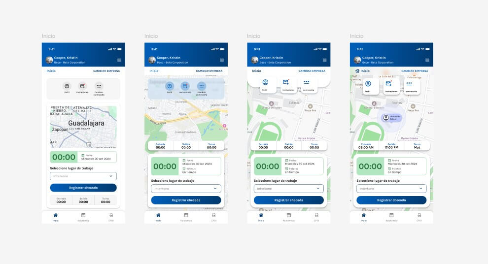
UX strategy and wireframes
I mapped out a reused user flow focused on fewer steps.
Created wireframes and ran first clic test to validate button checkin on Home Screen
UI Designed
I ensure to follow up the brand standard company guidelines.
Applied modular design system based on atomic design methodology in Figma to improve scalability and speed up hand off
Testing And iteration
- I built a high fidelity prototype
- Ran usability test with 10 internal users via optimal workshop
Key feedback
- Users loved new brand with core flow in Home Screen
- 2 users still missed confirmation feedback after did checkin
Results and impact
- I reduced time to complete a checkin from 3:00 minutes to 1:20
- Positive feedback from stakeholders and internal testers on usability and bran consistency
- Design system components reused in 5 other internal projects
Reflections
- This project taught me the value of small UX improvements, like clear buttons or subtle feedback, in increasing trust and clarity.
- I also strengthened my communications and learn to test designs earlier in the process to save time later.